A recruiter-friendly view of the projects I would use to evidence data quality, BI reporting, stakeholder thinking and commercial analysis.
A build-side project library showing source type, tools, methods, validation checks and the assumptions behind the dashboards.
Public sector · Public data
UK Police crime outcomes
★
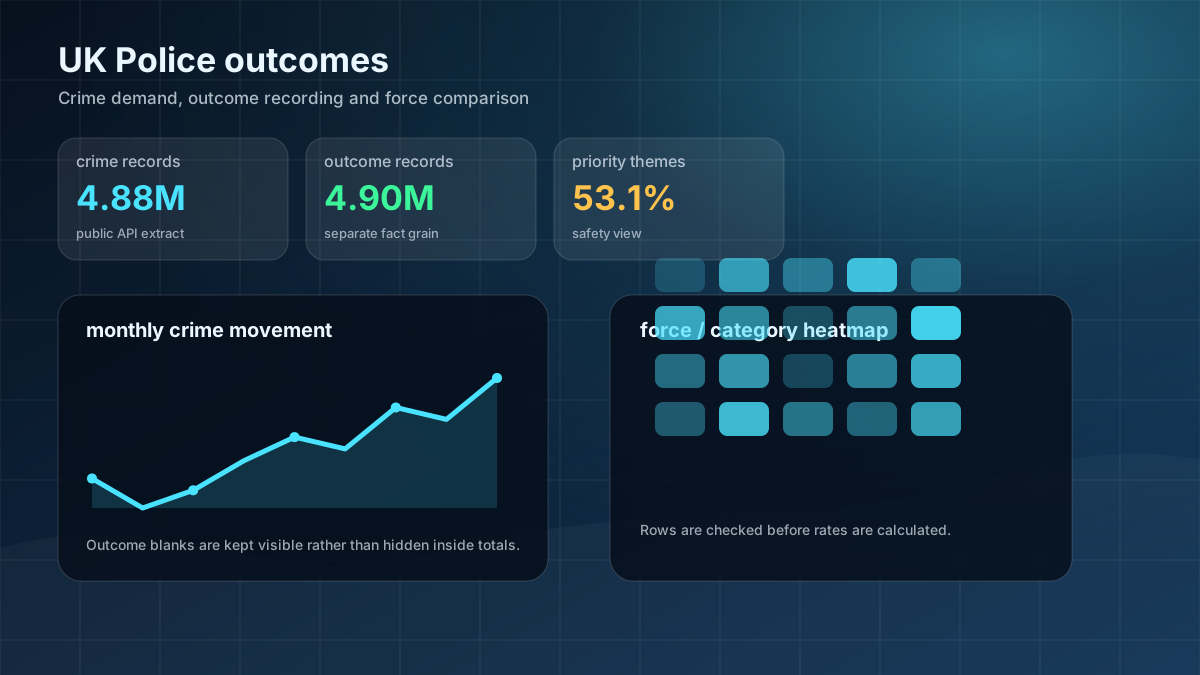
I used public crime and outcome data to show where demand is growing, which categories create the largest workload, and where outcome recording may need attention. It shows how I turn complex public-sector data into a clear performance story.
I reviewed the PBIX model, DAX, Power Query and fact-table structure, then processed 4.88M crime records and 4.90M outcome records using chunked Python aggregation. I kept record counts separate from distinct crime IDs to avoid misleading percentages.
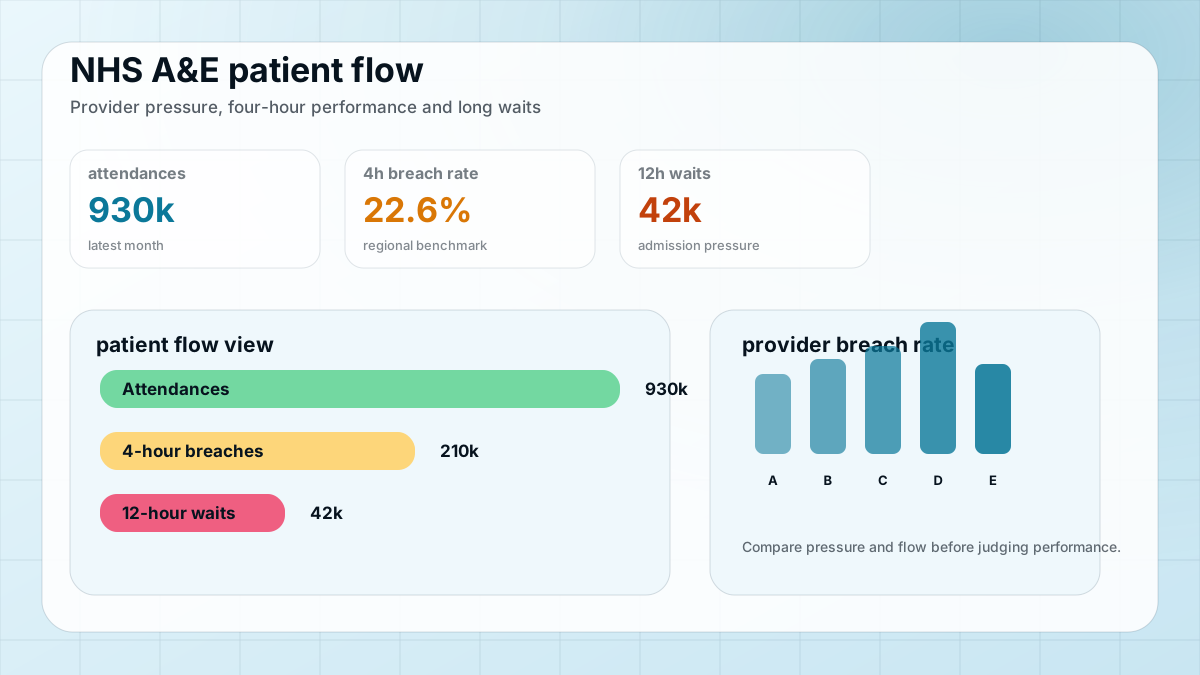
I built a healthcare performance dashboard tracking A&E attendances, four-hour breaches and 12-hour admission waits. It shows how I approach operational pressure, provider comparison and performance reporting.
I cleaned NHS England monthly A&E files, standardised provider and regional fields, created KPI summaries, and checked latest-month totals before creating regional and provider-level views.
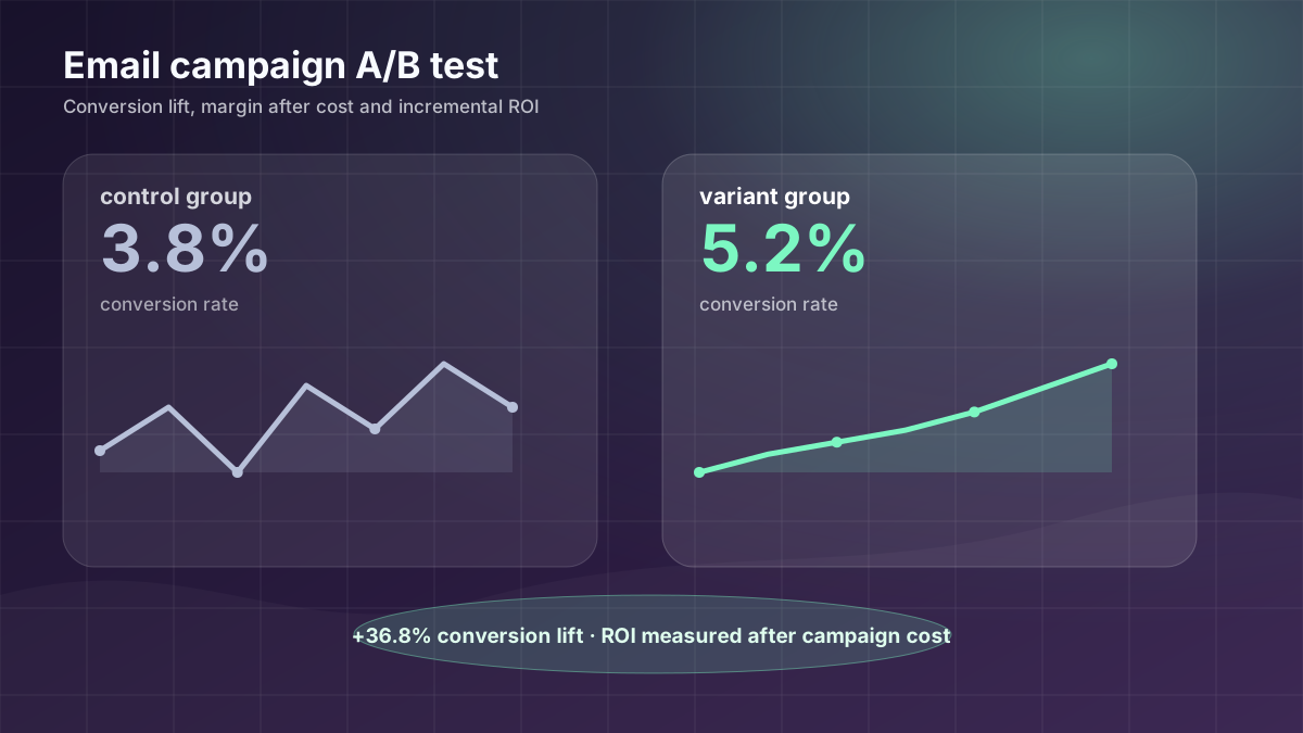
I analysed a campaign test to show whether emails created extra profit after cost, not just extra conversions. It shows commercial thinking and the ability to separate real uplift from headline performance.
I compared control and treatment groups using conversion rate, revenue per customer, incremental margin, campaign cost and ROI. I would improve the next version with confidence intervals and segment-level testing.
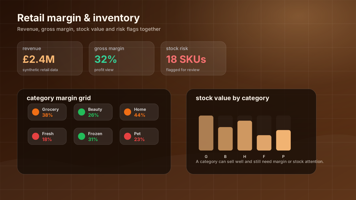
I created a retail dashboard that goes beyond sales totals by showing margin, profit and stock risk together. It helps identify where revenue looks healthy but availability or profitability may be under pressure.
I used synthetic sales and inventory data to calculate revenue, gross profit, margin, stock value and risk flags. I compared categories by both profit and margin, then separated stock-out and excess-stock risk.
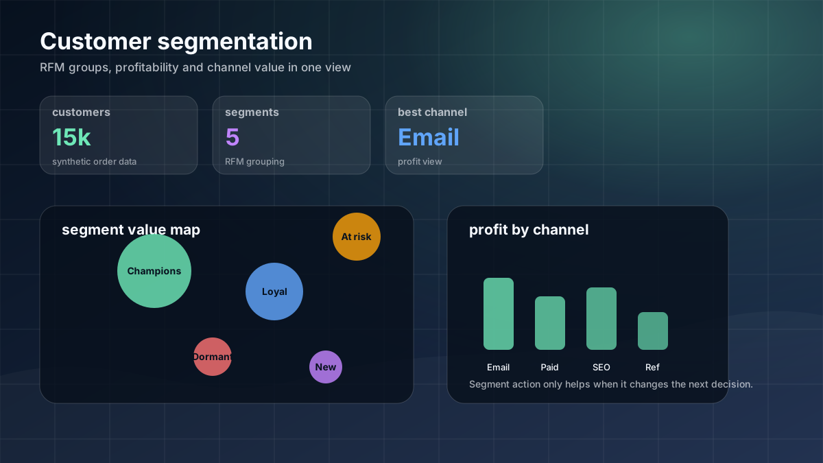
I segmented customers to show which groups are most valuable and where retention or reactivation should be prioritised. It shows how customer history can support targeted marketing decisions.
I calculated RFM scores using synthetic order-history data, grouped customers into readable segments and compared revenue, profit, frequency, recency and acquisition channel performance.
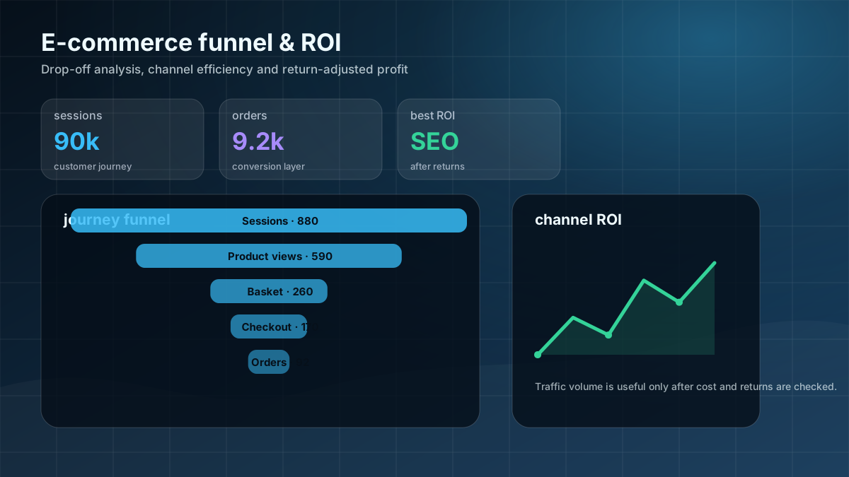
I built a funnel and ROI dashboard showing where customers drop out and which channels stay profitable after marketing costs and returns. It focuses on traffic quality, not vanity volume.
I analysed 90,000 synthetic sessions using session-to-order conversion, revenue per session, return effect, channel spend and gross profit after marketing. Python summaries were shaped into Power BI-ready outputs.
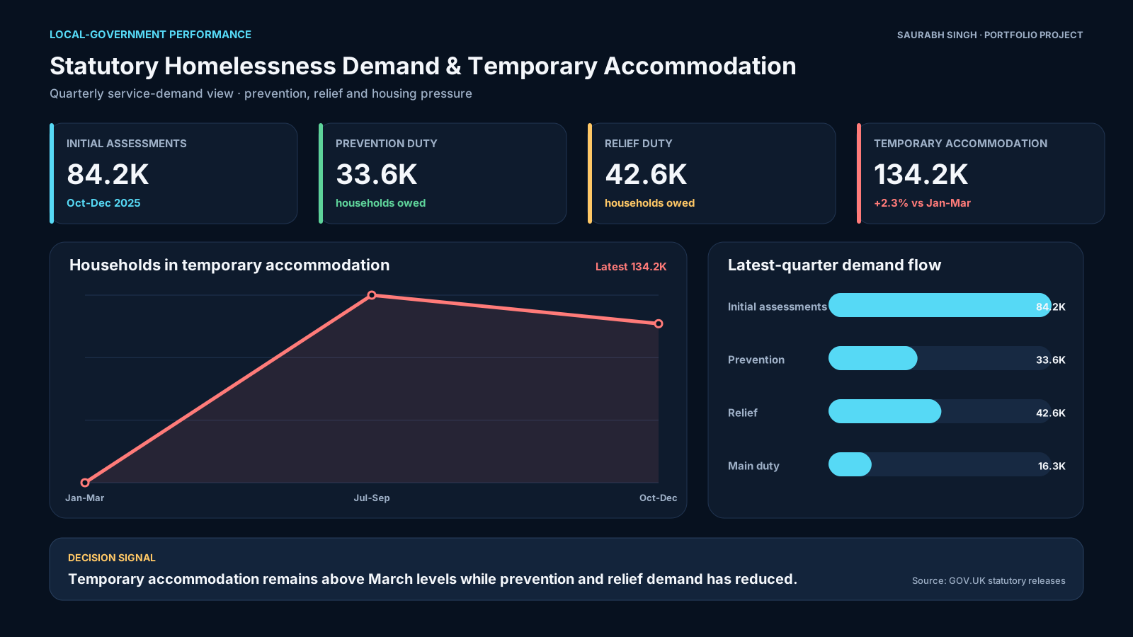
I turned statutory homelessness data into a readable council-style performance report covering assessments, prevention, relief duty and temporary accommodation pressure.
I cleaned GOV.UK homelessness release metrics, separated duty-stage counts from temporary-accommodation counts and built trend and KPI views for policy-stage reporting.
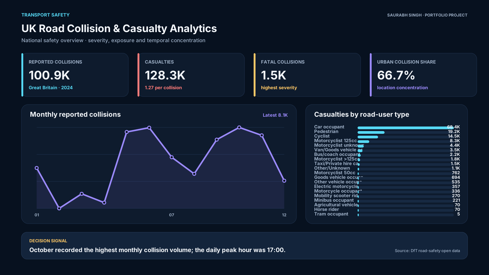
I analysed road-safety data to show where collision risk is concentrated by severity, location, road type and time of day.
I processed Department for Transport collision and casualty data with Python, then created summaries for severity, casualty type, monthly movement, location and hourly patterns.
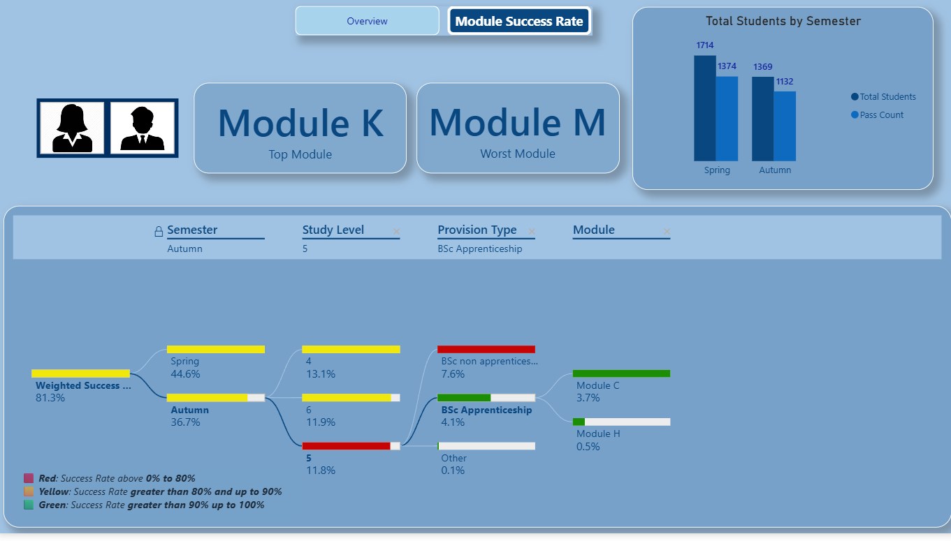
I built a higher-education dashboard to help academic teams identify weaker modules, pass-rate variation and progression risks early enough to act.
I used mock student data, modelled semester and module fields, created weighted success-rate measures and used traffic-light bands to make risk easier to scan.
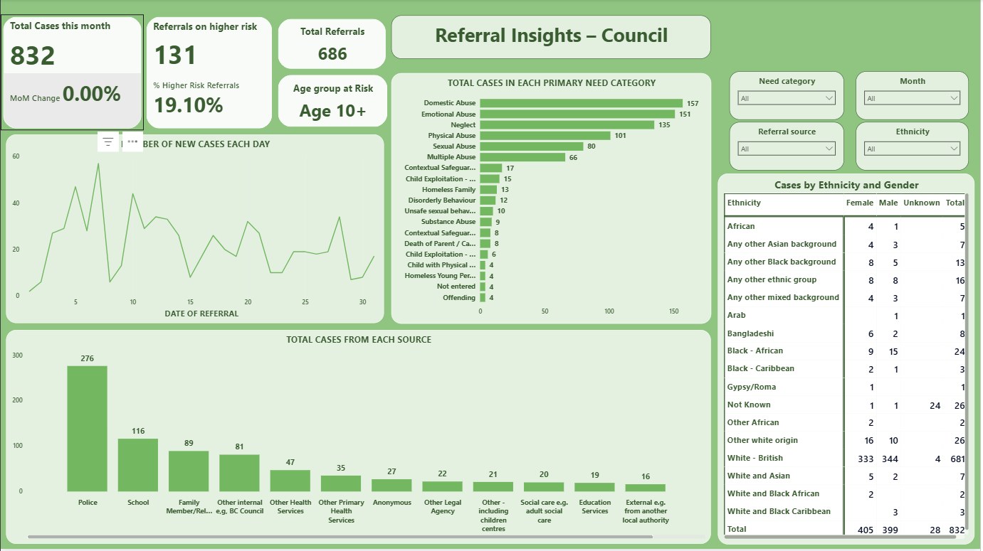
I built a mock council safeguarding dashboard to show referral volume, source, risk level and need category while avoiding real sensitive data.
I used mock data only, cleaned referral categories in Power Query and created DAX measures for referral volume, higher-risk share and need-category analysis.
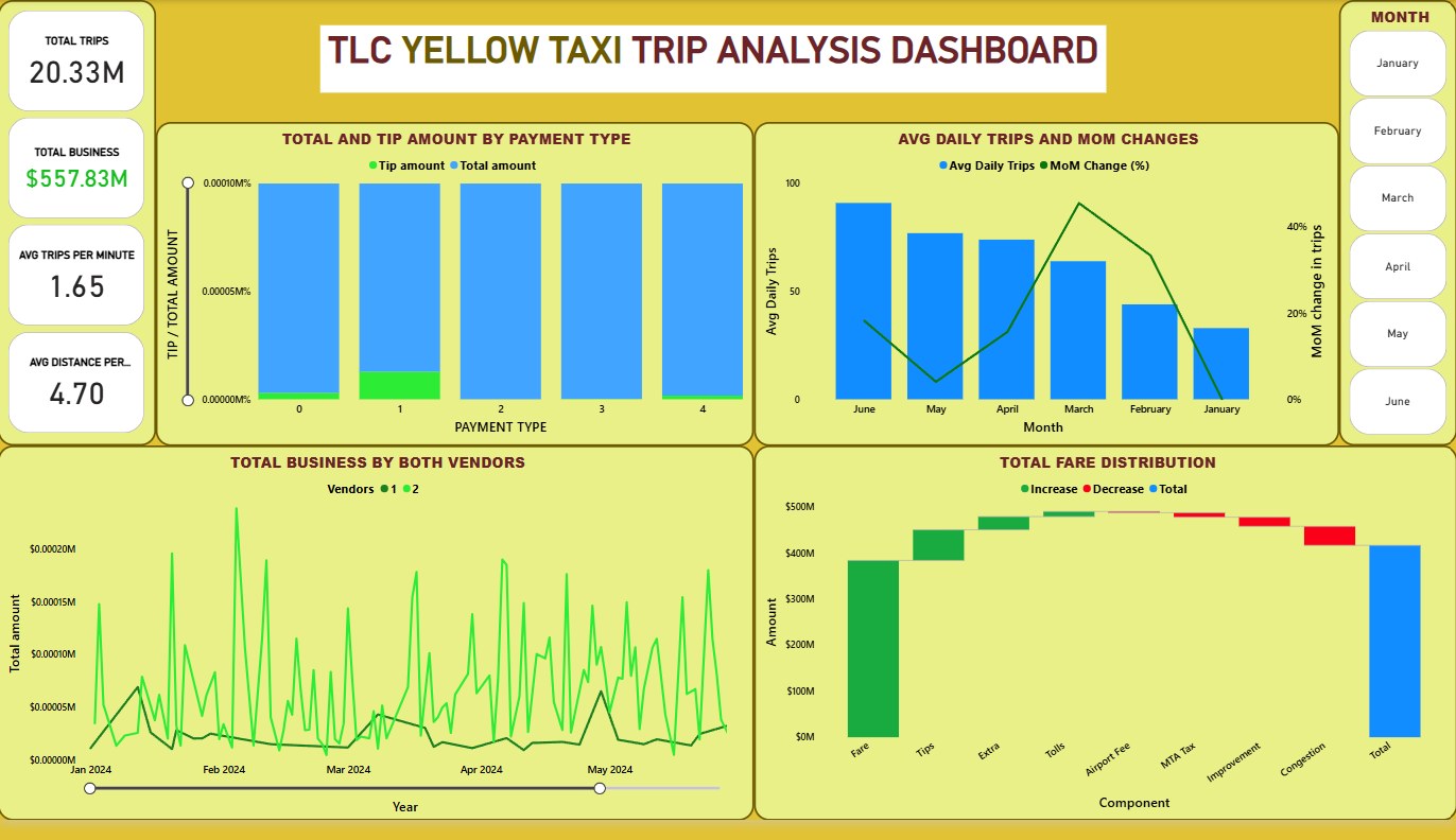
I built an end-to-end transport analytics project that moves from raw trip data to a dashboard showing trips, revenue, vendors and payment behaviour.
I used public NYC TLC data, built a cloud pipeline with Mage AI and BigQuery, transformed raw trip records and created a reporting layer for operational analysis.
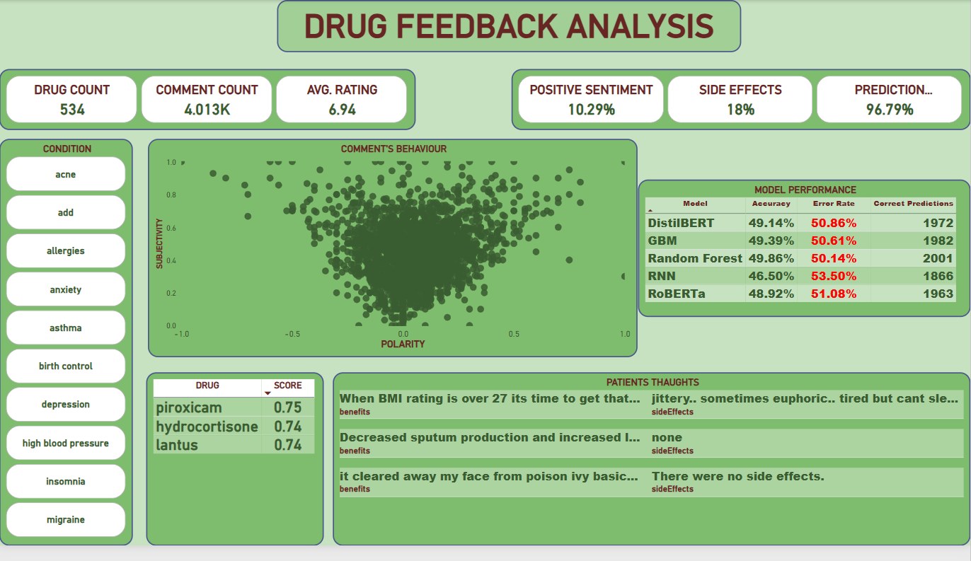
I used my MSc dissertation project to explore how messy patient review data can be turned into sentiment and recommendation-style reporting, with clear warnings around limitations.
I used Python, NLP and transformer model experimentation on patient review text, then created a Power BI reporting layer for sentiment, rating, side-effect and model-output exploration.
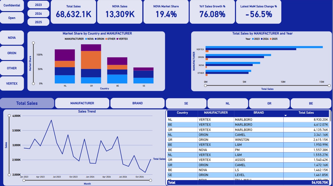
I built a sales dashboard focused on market share, monthly movement and manufacturer comparison, helping users understand what changed and where attention is needed.
I used Power Query and DAX to prepare category and manufacturer fields, then created sales, YTD sales, market-share and movement measures.
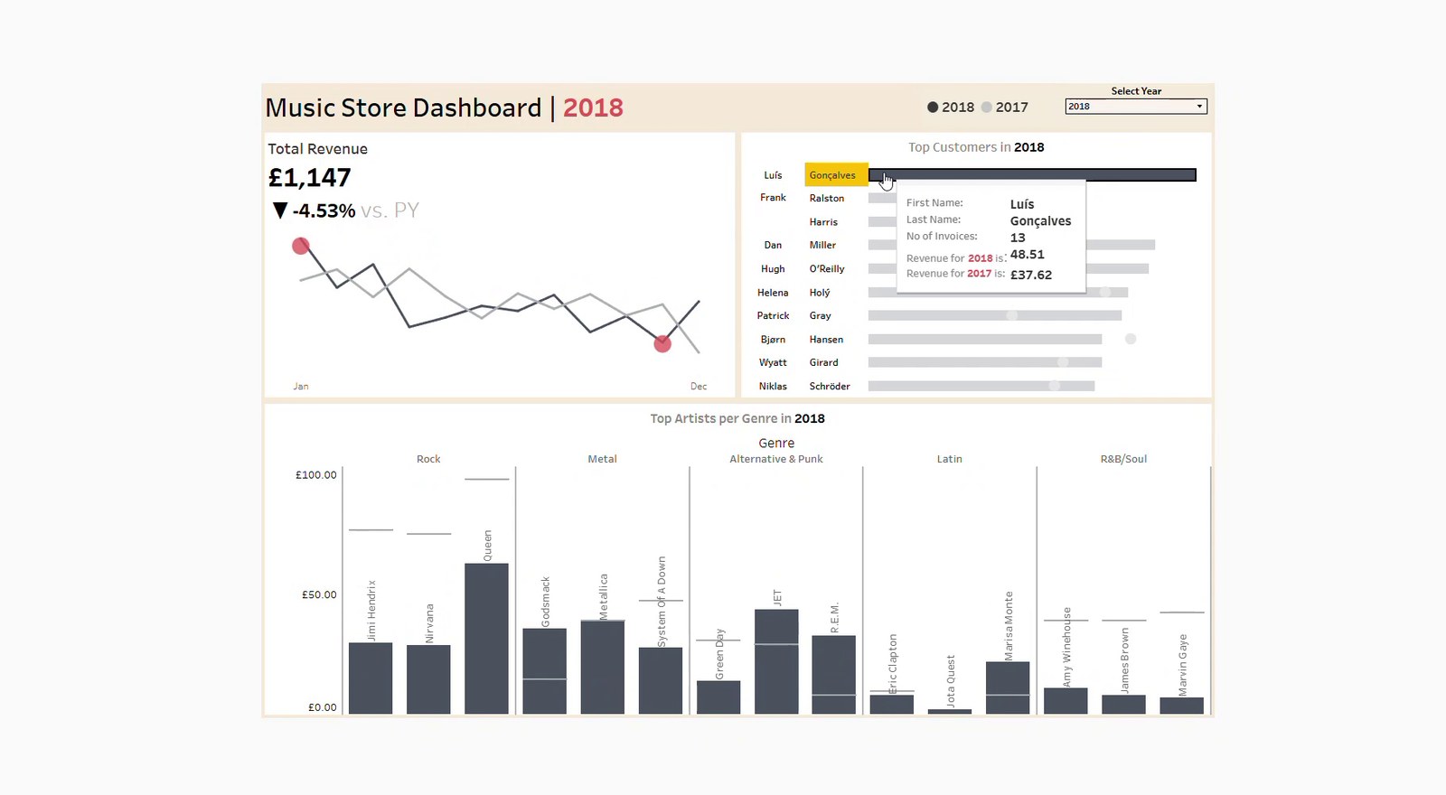
I created a simple small-business revenue dashboard showing sales movement, top customers and genre or artist contribution.
I used transaction-level music-store data to create revenue trends, customer ranking and contribution views, keeping the model simple and decision-focused.