Why this matters
Build summary
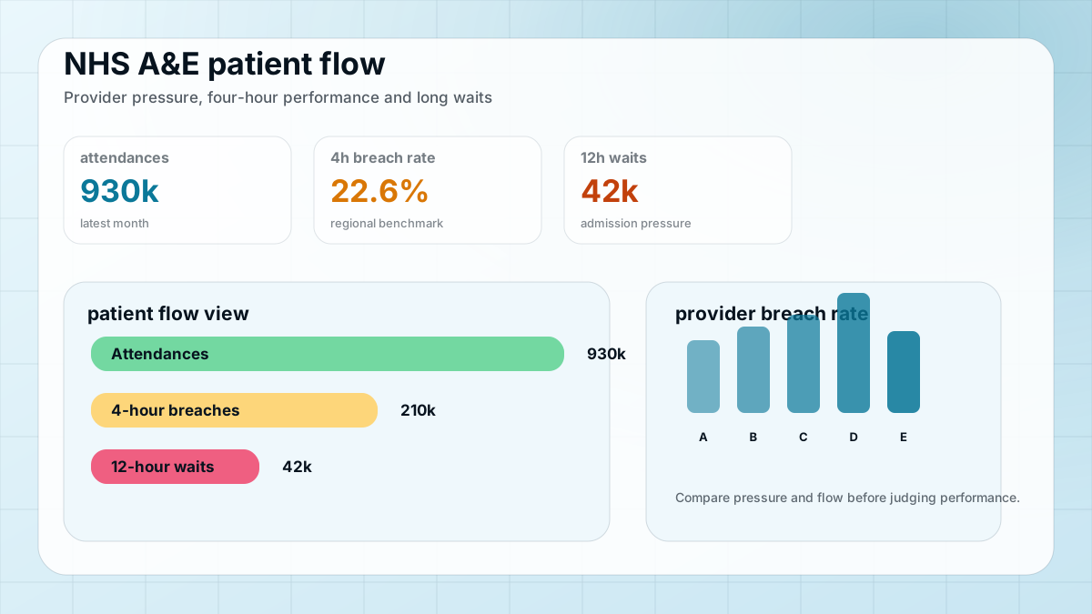
A&E pressure is easier to understand when national movement, regional pressure and provider outliers are visible in one view.
I cleaned NHS England monthly A&E files, standardised provider and regional fields, created KPI summaries, and checked latest-month totals before creating regional and provider-level views.
Key numbers
May 2026
latest month
2.46M
attendances
24.3%
4-hour breach rate
What I wanted the report to help with
How I approached it
- Make the main performance question easier to scan.
- Separate headline totals from the detail that explains them.
- Show enough context for a non-technical user to trust the next action.
- Cleaned public monthly A&E files and standardised date, provider and region fields.
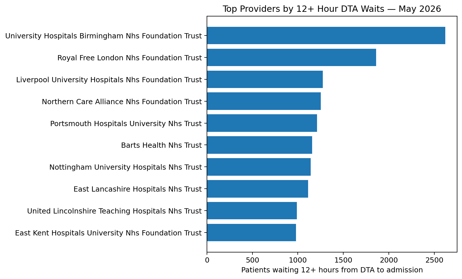
- Created measures for attendances, four-hour breach rate and long admission waits.
- Checked latest-month totals before building provider and regional visual views.
Technical inspection notes
- Standardised monthly A&E fields before comparing providers because the operational story depends on consistent definitions.
- Built breach-rate and 12-hour wait views separately so high attendance does not automatically get mistaken for poor performance.
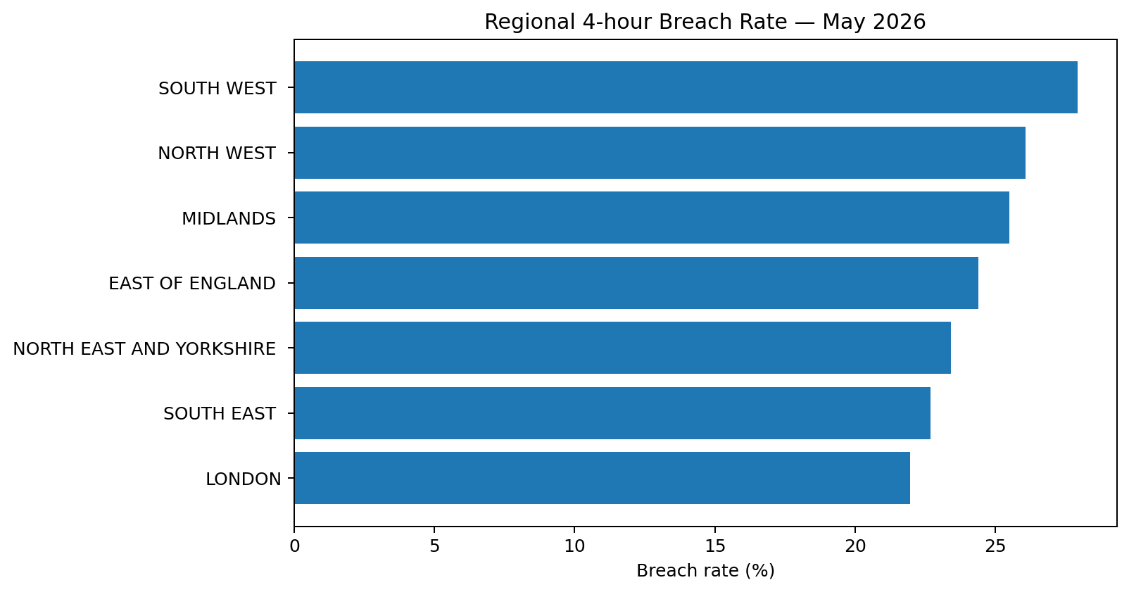
- Checked latest-month totals before creating regional comparisons.
- Used provider and region cuts to support both operational scanning and deeper investigation.
Dashboard snapshots
These snapshots show how the analysis was turned into decision-ready visuals.
Click any screenshot to inspect the dashboard evidence more closely.
What the analysis showed
- The latest month analysed was May 2026.
- The dataset showed 2,457,398 attendances.
- The four-hour breach rate was 24.3% in the latest month analysed.
What I would improve next
- Add longer seasonal trend comparison.
- Add provider peer groups for fairer benchmarking.
- Add plain-English metric notes for non-NHS users.