Why this matters
Build summary
Police and community-safety teams need more than a count of recorded crime. They need to see demand, outcomes and recording quality together so risk is not hidden behind headline totals.
I reviewed the PBIX model, DAX, Power Query and fact-table structure, then processed 4.88M crime records and 4.90M outcome records using chunked Python aggregation. I kept record counts separate from distinct crime IDs to avoid misleading percentages.
Key numbers
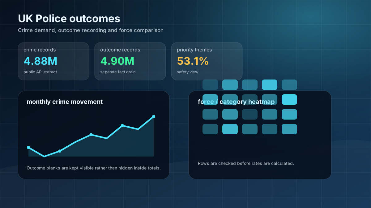
4.88M
crime records
4.90M
outcome records
53.1%
safety-priority themes
What I wanted the report to help with
How I approached it
- Make the main performance question easier to scan.
- Separate headline totals from the detail that explains them.
- Show enough context for a non-technical user to trust the next action.
- Extracted the embedded Power BI model and reviewed DAX, Power Query and table structure.
- Processed large fact tables in Python using chunked aggregation.
- Separated fact-table record counts from distinct crime IDs to avoid misleading percentages.
- Checked missing location and missing outcome fields before writing findings.
Technical inspection notes
- Checked the model grain before calculating rates because crime records and outcome records are not the same thing.
- Used chunked Python aggregation for the large fact tables so the analysis stayed manageable outside Power BI.
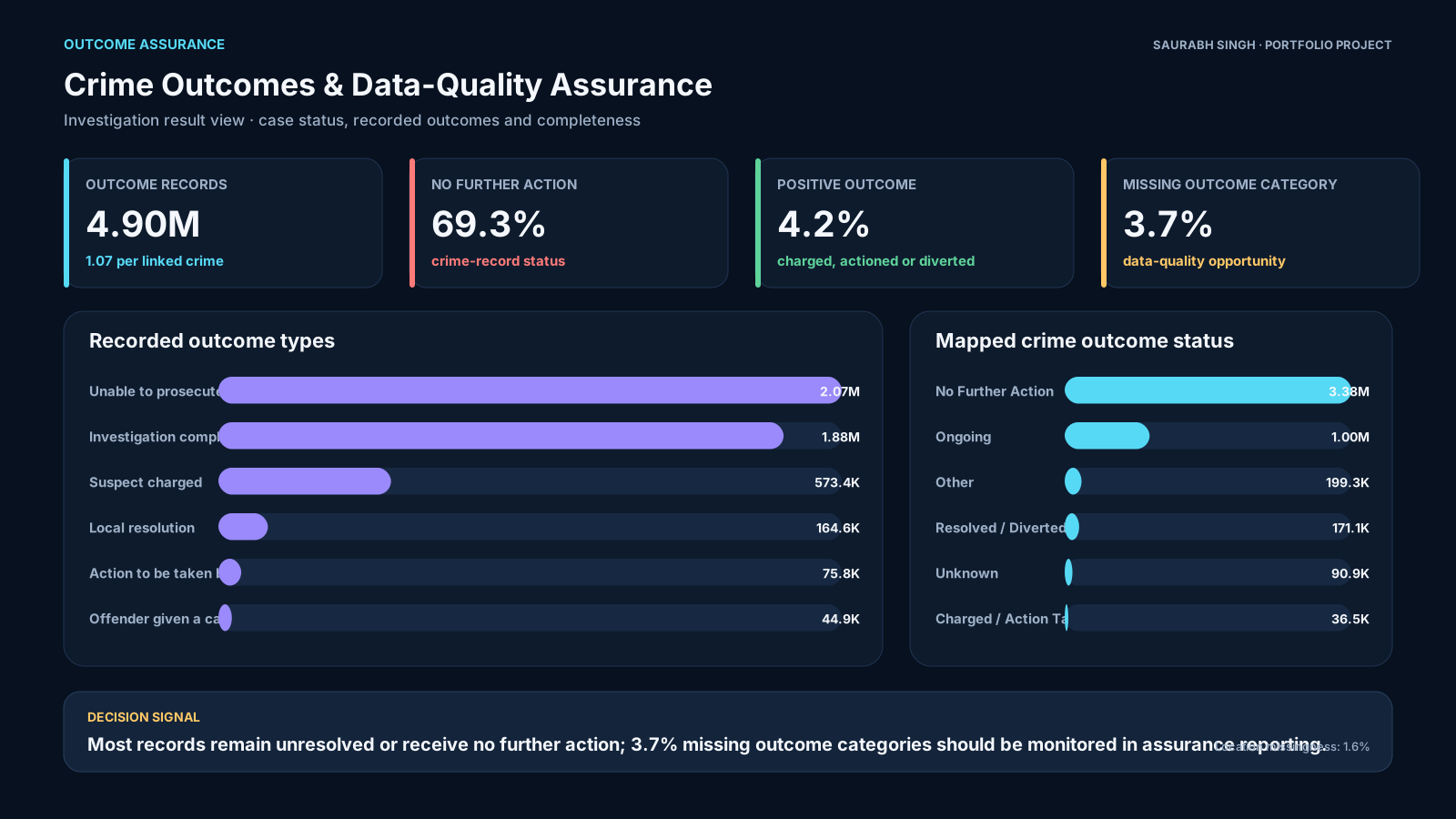
- Separated missing outcome status from recorded outcomes instead of hiding blank categories inside totals.
- Kept force, category, month and outcome status as separate analysis cuts so users can move from headline demand to root cause.
Dashboard snapshots
These snapshots show how the analysis was turned into decision-ready visuals.
Click any screenshot to inspect the dashboard evidence more closely.
What the analysis showed
- March 2026 crime records were 13.9% higher than February.
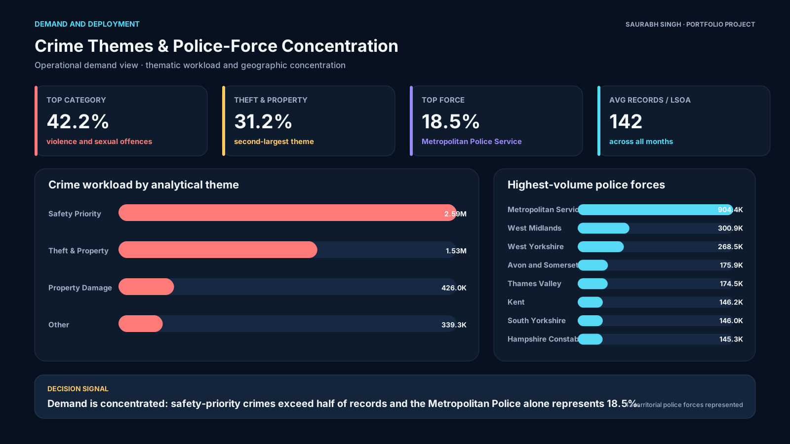
- Violence and sexual offences made up 42.2% of records.
- Missing outcome categories affected 3.72% of records.
What I would improve next
- Add force-level benchmarking over a longer period.
- Automate refresh from the public API where the source allows it.
- Add clearer non-technical definitions for outcome categories.