Why this matters
Build summary
Academic teams need performance reporting that shows where intervention may be needed without exposing real student data.
I used mock student data, modelled semester and module fields, created weighted success-rate measures and used traffic-light bands to make risk easier to scan.
Key numbers
81.3%
weighted success
Mock
student data
Power BI
dashboard
What I wanted the report to help with
How I approached it
- Make the main performance question easier to scan.
- Separate headline totals from the detail that explains them.
- Show enough context for a non-technical user to trust the next action.
- Used mock student and module records.
- Created weighted success-rate logic.
- Built pass/fail and progression-risk views.
Technical inspection notes
- Used mock student data to avoid sensitive records while still showing the reporting logic.
- Modelled module, semester and outcome fields before calculating weighted success rates.
- Used traffic-light bands only after defining the thresholds, so the colours support the measure rather than replace it.
- Designed the report for early scanning by academic teams rather than a one-off static summary.
Dashboard snapshots
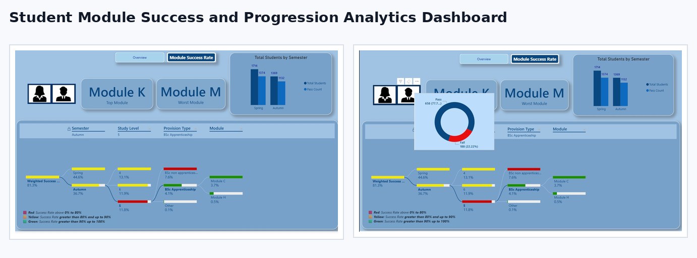
These snapshots show how the analysis was turned into decision-ready visuals.
Click any screenshot to inspect the dashboard evidence more closely.
What the analysis showed
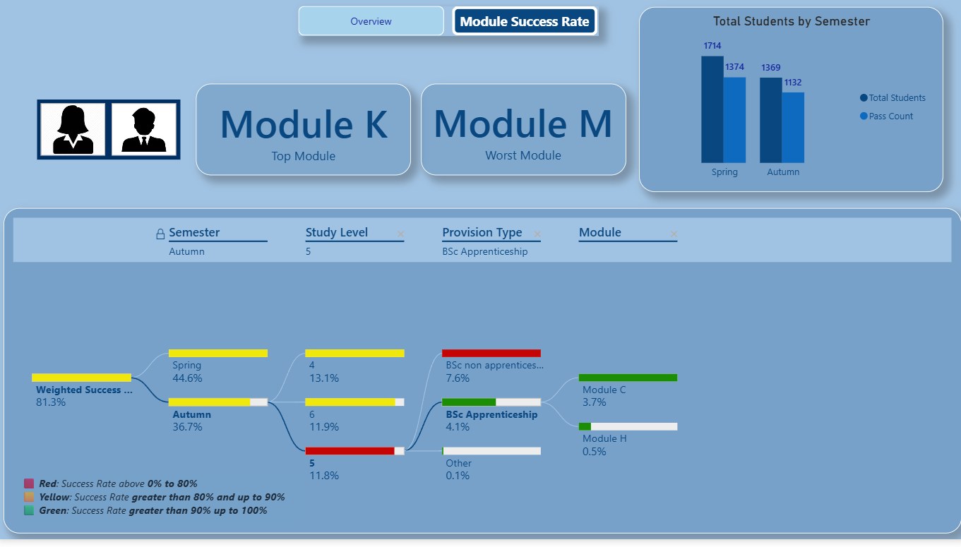
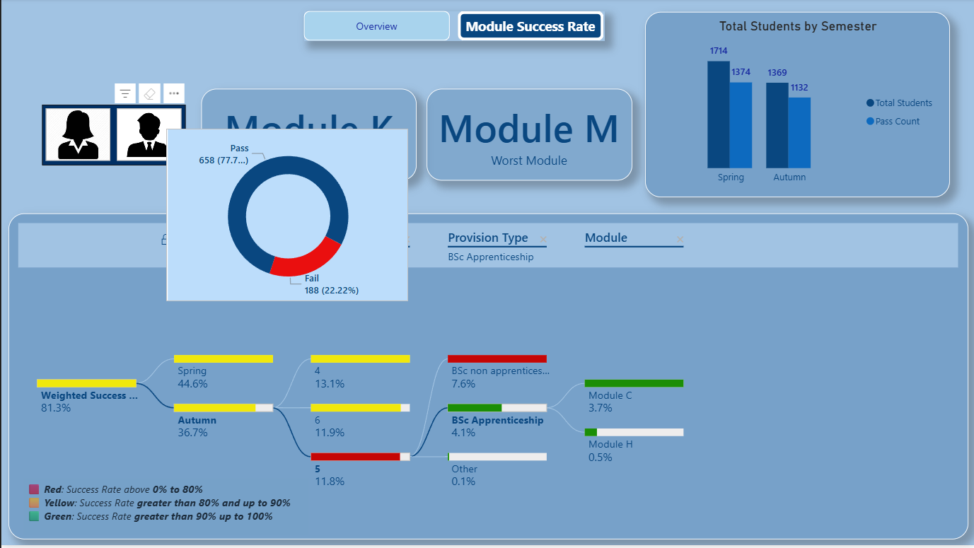
- The selected view showed an 81.3% weighted success rate.
- Module-level views made weaker areas easier to scan.
- Traffic-light bands helped prioritise review.
What I would improve next
- Add real-world governance notes.
- Add cohort movement between semesters.
- Add filters for programme, level and demographic checks.