Why this matters
Build summary
Road-safety reporting is more useful when severity, time and location are connected instead of viewed as separate tables.
I processed Department for Transport collision and casualty data with Python, then created summaries for severity, casualty type, monthly movement, location and hourly patterns.
Key numbers
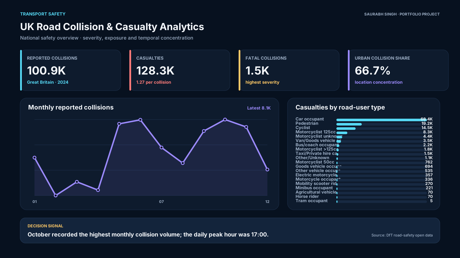
100,927
injury collisions
128,272
casualties
2024
data year
What I wanted the report to help with
How I approached it
- Make the main performance question easier to scan.
- Separate headline totals from the detail that explains them.
- Show enough context for a non-technical user to trust the next action.
- Processed DfT open data in Python.
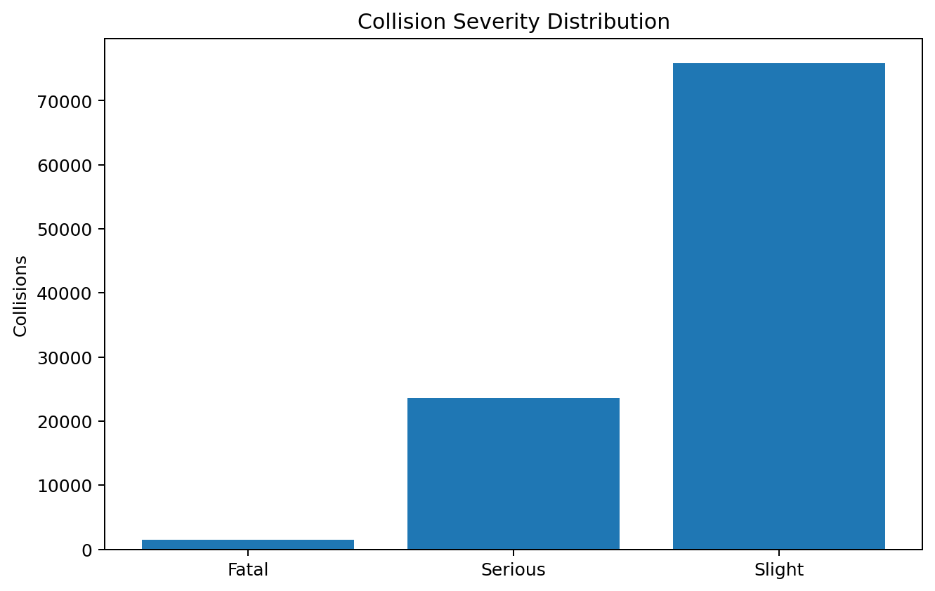
- Created severity and casualty-type summaries.
- Prepared outputs for dashboard visuals and hotspot-style analysis.
Technical inspection notes
- Prepared collision and casualty data separately before joining summary views.
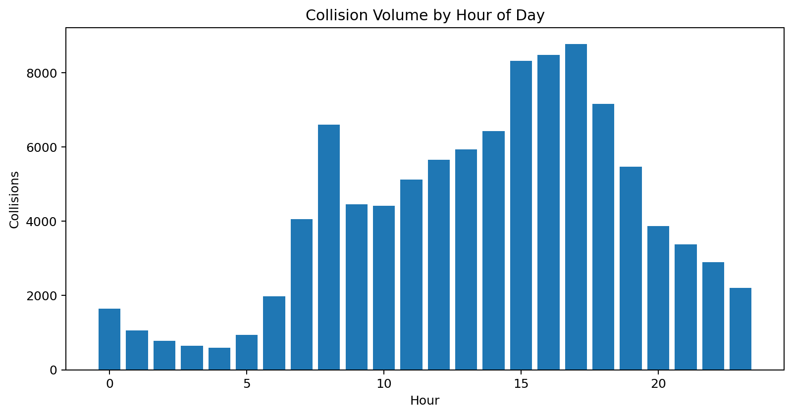
- Compared severity, location, road type and hour of day so the report can move from “how many” to “where and when”.
- Used processed summaries for the visuals to keep the report responsive.
- Kept public-data limitations visible because location and reporting practices affect interpretation.
Dashboard snapshots
These snapshots show how the analysis was turned into decision-ready visuals.
Click any screenshot to inspect the dashboard evidence more closely.
What the analysis showed
- The 2024 data included 100,927 reported injury collisions.
- The data included 128,272 casualties.
- Patterns differed by hour and severity group.
What I would improve next
- Add police-force or local-authority filters.
- Add road-type benchmarking.
- Add mapping layers if publishing as an interactive BI report.